
Martin von Lupin // Information design
Hej, I'm Martin. I'm an information designer based in Sydney, Australia.
I'm interested in data visualisation, user experience and creative coding.
Currently I work as UX/Information Designer at Small Multiples.
I hold a Bachelor degree in Interface Design from the University of Applied Sciences Potsdam, Germany. View my experimental projects below, find out about me or view my professional portfolio.
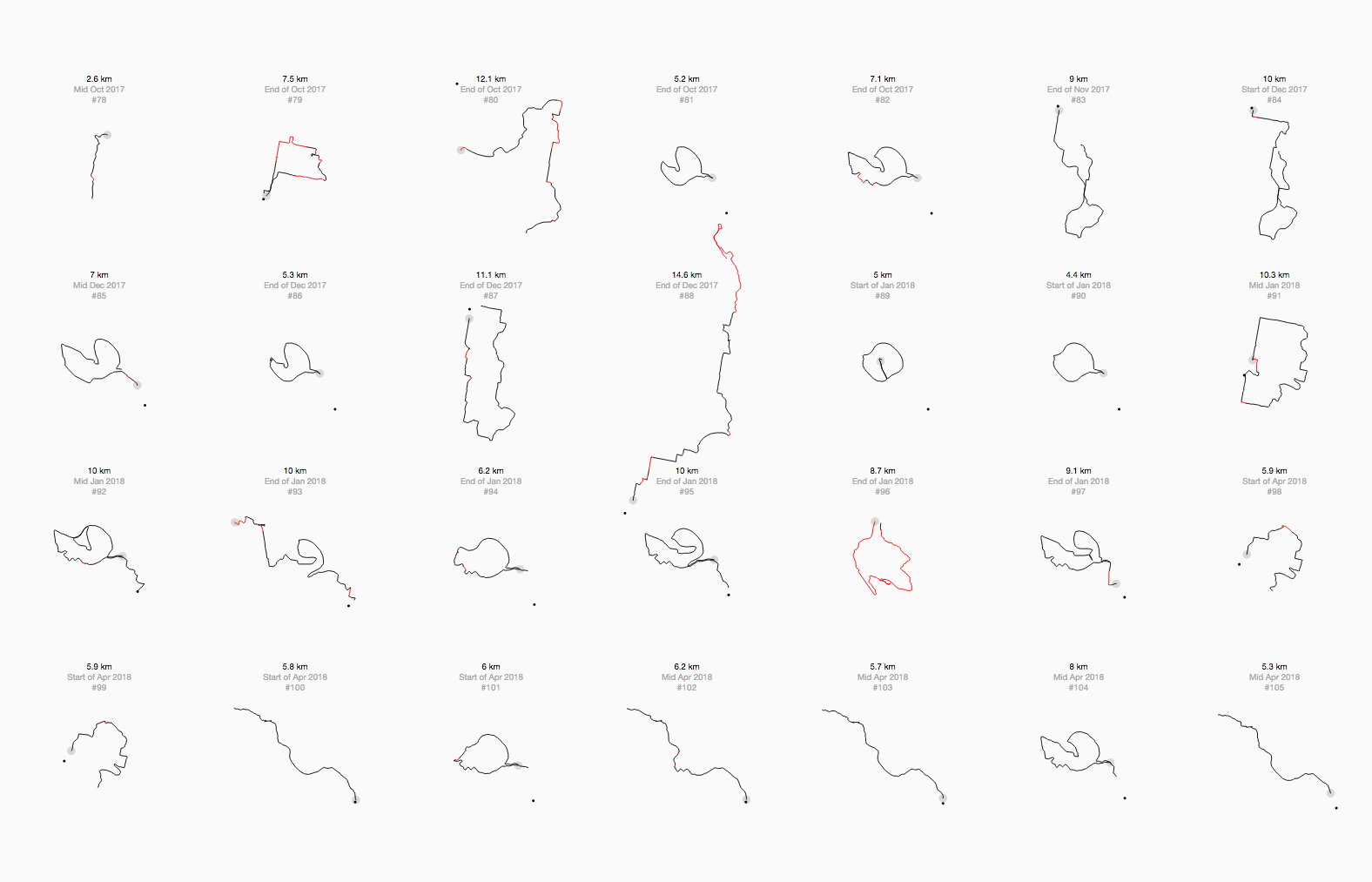
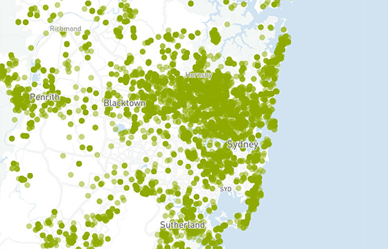
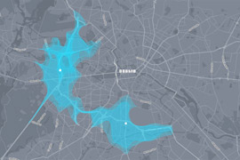
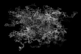
Visualising my Sydney runs
Mapping all my Sydney routes and indicating whether I ran a new or a familiar segment. Read more
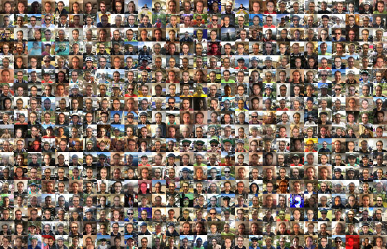
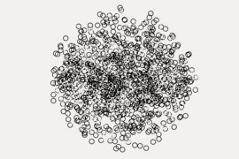
A selfie a day
I take a selfie every day since 2011. Read more
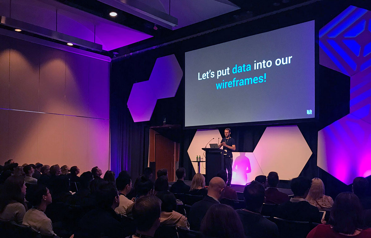
Talk at UX Australia 2019
The Lorem Ipsum of data visualisation and how to design data-driven wireframes. Read more
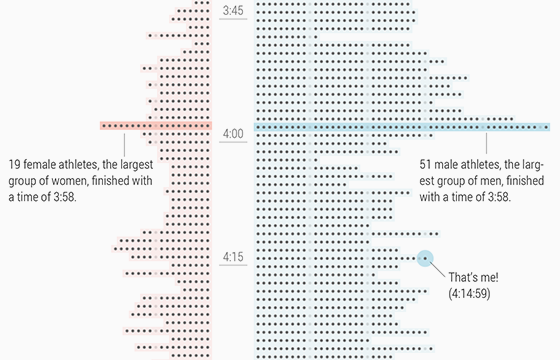
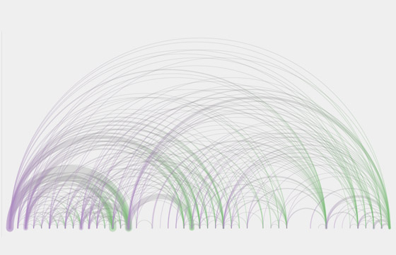
Sydney Marathon results
Responsive webpage visualising results from Sydney Marathon 2019, created with R and ai2html. Read more
Mapping frogs in Australia
Visualising frog recordings from citizen science app FrogID by Australian Museum. Read more
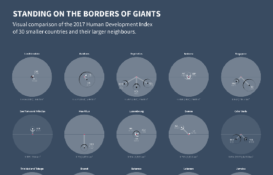
Standing on the borders of giants
Visualising Human Development Index of small countries. Submission for World Data Visualization Prize. Read more
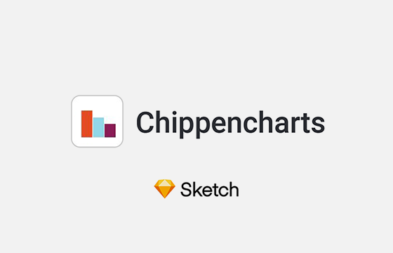
Chippencharts
I've developed a Sketch plugin for creating charts with random or user-defined data for use in mockups. Read more
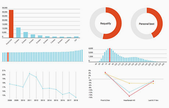
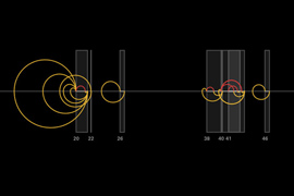
Sydney's city2surf 2018
10 data insights from the City2Surf 2018, including most common finish time, start group, age and performance. Read more
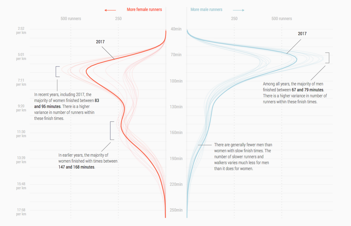
Sydney's city2surf 2017
Visualising Sydney's annual 14km running event city2surf. How does Heartbreak Hill affect performance? Read more
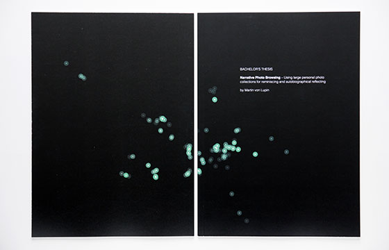
Narrative Photo Browsing
My bachelor thesis project where I present a scroll-driven interface for photo exploration with visual clues for dates and locations. Read more
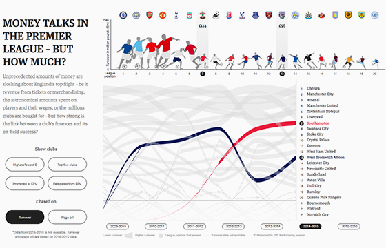
English Premier League - Money Talks
Interactive for The Guardian that explores the relationship between a club's finances and success. Read more

FrogID mobile app
UX design for app for the Australian Museum; a citizen science project to track frog populations. Read more
emosaic
Emosaic is a web based emotion-in-text visualisation that transforms emotions to colours for text exploration and analysis. Read more
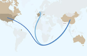
Chicken Roadtrip
Interactive visualisation to explore the world trade of living chickens and to find insights for the (sometimes) tremendious trading distances. Read more
Isoscope
Isoscope is an interactive tool that creates aesthetic visuals about locations that are reachable by car in a chosen time from a chosen location. Read more
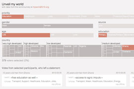
Unveil my world
A visual exploration tool for data from the my world survey. Filter through the results and find out who those people are that participated! Read more
White Walkers
A processing based computer art project for the exhibition Licht ins Dunkel dedicated to Frieder Nake. Read more
Am I in time?
The visualisation shows peoples waiting habit at a bus stop at lunch time on a holiday in Potsdam. Read more
I'm losing grit
A processing based trial to create a tweetable code with less than 140 characters that outputs art. Read more
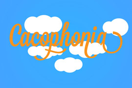
Cacophonia
Experimental music game using Kinect. Even though making music is not the goal, you produce an unique instrumental while playing. Read more
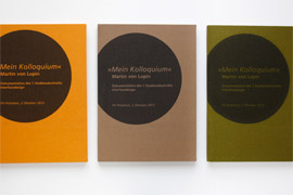
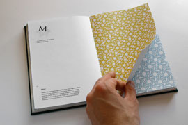
Kolloquium
This is a book documentation of my basic studies. It shows relevant works you also find on this website. Read more
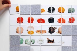
The six variations
Systemic transforming series of round daily objects that reveal surprising insights about material, texture or resistence. Read more
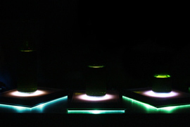
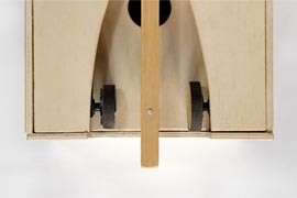
Interactive beer mat
Physical interactive beer mat that gives optical feedback about the fill of beer bottles. Read more
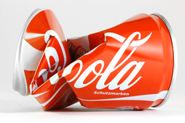
Wanna crush my trash?
Crush objects using CSS and your browser window. You can choose between a coca-cola can, milk container, or tea container. Read more
Cubosh
A critical design object that questions our appreciation towards digital music data. Read more
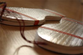
Drumshoes
Interactive insoles that are the result of an exciting keyboard-hack. They can be used to make a drum beat when the stepping on them. Read more
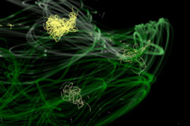
Earthlights
Visualisation of the worlds light polution. It's at the exciting edge between data visualisation and generative art. And it's interactive. Read more
Typo book
Book showing all results of a typography class. The book was of course self designed, but also self printed and bound. Read more
Movie monologue visualisation
Animated visualisation of a monologue in the movie 25th hour, that unfolds a system behind an arbitrary appearing list of objects of hate. Read more
Impressum // © 2020 - Martin von Lupin